Overview
This page contains the exercises for Part 2 (the last 5 weeks) of COMS10012 Software Tools. As with Part 1, each week usually contains two workbooks -- sets of exercises which are supported by videos to watch, or by set reading materials (more prominent in this part of the unit). The exercises will require you to do some work within your Linux VM in Vagrant, which we'll be supporting in the labs, but which you should attempt before the lab to get the most out of the unit.
Part 2 focuses on web technologies. The Web is one of the largest software ecosystems ever built, and a lot of programmers will either work on web technologies or make use of them to present their other work. We'll be covering the basics: how to write webpages, style them using CSS, make them interactive using Javascript. Then we'll look at ways to treat websites and webpages as parseable resources, and conclude by looking at the kinds of encryption needed in common web transactions.
HTTP
HTTP, or HyperText Transfer Protocol, is one of the basic protocols that make up the internet - and usually the lowest level that a web developer needs to concern themselves with frequently.
Videos
Reading
- RFC 7230 - this is a comprehensive outline of the protocol for HTTP, but you can focus on sections 2.1, 2.2, 2.7 and 3.
Exercises
Optional
You can read the RFC for the internet protocol IP at RFC 791.
You can read the RFC for the transmission control protocol at RFC 793.
You can read the RFC for URIs at RFC 3986.
If you want to, you can read further about HTTP (including the new HTTP/2 standard) on the Mozilla Developer Network.
Set-up
From this point on we will be running web servers on our development environment, and connecting to them with web browsers. To get this to work we need to set some things up first, so please follow the instructions for your environment:
Lab machine, native
These instructions apply if you are working directly on a lab machine (not using a Vagrant VM).
You do not need to set up anything special. As you are not root, you can only serve from TCP ports 1024 or above, but that is not a problem - we will use port 8000 by default.
Proceed directly to exploring HTTP.
Lab machine, with Vagrant
If you want to run a server inside a Vagrant VM and connect to it with a browser directly on the lab machine (outside the VM), then you will need to tell Vagrant which ports within the VM to make available outside the VM. Open your Vagrantfile and add the line
config.vm.network "forwarded_port", guest: 8000, host: 8000
in the main block (just before the config.vm.provision line will do), then restart your VM if it is already running. This tells Vagrant to open a server on port 8000 on the host (the lab machine), and forward any traffic it receives to port 8000 on the VM.
You can now start the VM, run a server inside the VM, and connect to it from the browser on the lab machine.
Proceed to exploring HTTP and run the server (the nc command) inside the VM, but use the browser on the lab machine directly. Note that the http-response file mentioned on that page needs to go in the correct folder inside the VM, where you started the server.
Your own machine, without Vagrant
If you have a system that supports the nc and wget commands (Mac OS, Linux or WSL should all offer the option to install them) then you can proceed directly to exploring HTTP.
You might get one or more firewall warning pop-ups, which you will have to "allow".
Your own machine, with Vagrant
Configure vagrant as in the section "Lab machine, with Vagrant" above, that is add the line
config.vm.network "forwarded_port", guest: 8000, host: 8000
to the Vagrantfile and restart Vagrant. You can now run servers in the VM and clients (such as your favourite browser) on your own machine.
You might get firewall warning pop-ups, which you will have to "allow".
Proceed to exploring HTTP. If you don't have wget on your own machine, you can open a second terminal and log in to the VM from there, then run both wget and the server inside the VM that way - then later on, when you're using a browser instead of wget for the client, you can just open the browser on your own machine.
Over SSH
For security reasons, you will not be able to run a web server on a lab machine (whether in a VM or not) and connect to it from your local web browser. If you have no other option than to use a remote connection, you should use x2go to connect to a lab machine with a graphical user interface, and run both the server and browser through that. This software uses ssh internally so you need to connect to rd-mvb-linuxlab.bristol.ac.uk using seis.bris.ac.uk as the proxy server.
Exploring HTTP
Before you start
To avoid an annoying problem, before we run our own server we are going to check that no-one else is already using the TCP port we want.
Run the command
wget localhost:8000
on the machine where you want to run the server. It should time out after a couple of seconds (or instantly) with "failed" and some error message.
If it succeeds (shows "Connected" or "200 OK" anywhere), then someone or something else is using port 8000.
Next, run
netstat -tan
and check that there is no line with the value "8000" under Local Address and a state of LISTEN or ESTABLISHED. If you get a lot of lines, netstat -tan | grep 8000 will help. It does not matter if 8000 appears in the Foreign Address column, but there must be no-one using port 8000 under Local Address.
netstat should work on every OS including Windows (Microsoft has written their own version), but wget doesn't exist by default on Windows machines although it can be downloaded for free.
If either wget or netstat suggests port 8000 is in use,
- If you are on a lab machine, it could be that another student is using port 8000 (maybe they are logged in via SSH).
- You might have other software (such as a web development package) already using that port.
You can try port numbers 8001, 8002 etc until you get one that is definitely not being used and then replace 8000 with that in all further exercises today, or (on your own machine) you can stop whatever program is using the port first.
Note: if you have vagrant running and set up as described on the last page, and you run wget localhost:8000 on your own machine (not the VM), then vagrant will be using port 8000 and wget might block waiting for a reply. This is the correct behaviour, and this is why I asked you to run wget on the machine where you want to run your server, not the client. If you want to do the following exercises with both server and client on your own machine, then you need to stop the vagrant VM first or remove the 8000 line from your vagrantfile.
A basic HTTP server and client
Open a terminal on the machine where you want to run the server, and download the file http-response to the folder where your terminal is open (for example with wget). Then run the command
nc -l -p 8000 < http-response
This calls the tool nc ("network cat") and tells it to listen on TCP port 8000 (-l -p 8000), e.g. to run a server there. When a client connects, nc will by default read from its standard input and write this to the client, so we use a shell redirect to make it read from a file instead. The file contains some standard HTTP:
HTTP/1.1 200 OK
Content-type: text/plain
Content-length: 18
Connection: close

Hello over HTTP!
(If you want to type this out yourself or copy-paste, you must save the file with CRLF line endings and put two newlines after the hello message.)
nc will block until you connect a client. Open another terminal on the machine you want to run your client and run
wget -q -S -O - localhost:8000
You have now made a HTTP connection from the wget client to the nc server. The server terminal should print out the HTTP request it got from the client (this is built into wget) and the client should print out the response from the server (which comes from the file).
Connecting with a web browser
Run nc -l -p 8000 < http-response again on your server machine (kill the old one with Control+C first if it hasn't terminated already).
Open a web browser on your client machine (e.g. your own PC/laptop, or a lab machine). If you're using chrome/edge or firefox, open the debug tools (F12) and go to the network tab before you open the page.
Navigate to localhost:8000. You should see the line "Hello over HTTP!" and nc will print the HTTP request from your browser. You can then close it with Control+C if it doesn't terminate by itself. In your browser's debug tools, on the network tab you should see a file localhost, click this and then select Headers in the details that appear.
This details page shows you the HTTP request details, including the response code (200 OK in this case) and all the headers sent in both directions. This screen is one of the first places you should look at when something web-based that you've coded is not working correctly or at all, as HTTP is normally the lowest layer you need to care about.
In particular, the Content-type header is a common source of mistakes: if you want to serve e.g. a script or a stylesheet but you don't set the correct type header, your browser may download the file just fine but won't do anything with it. Similarly, whether you send text/plain or text/html determines whether the browser will interpret a file you navigate to as HTML or not.
A web server in C
On your server machine, clone the repository https://github.com/emikulic/darkhttpd which contains a single-file web server in just under 3000 lines of C. You do not need to understand this code, and in 2nd year Computer Systems A you will be able to write a web server in around 10 lines of golang instead and understand the concurrency principles behind it.
Compile the program either with make or simply gcc darkhttpd.c -o darkhttpd. Its job is to serve files within a folder, so make a subfolder called web and then run it with ./darkhttpd web --port 8000. You can stop it again at the end of the exercise with Control+C.
You can now experiment with the following:
- Create some files (plain text, HTML, image etc.) in
web/. - Access them from your browser with
localhost:8000/FILENAME, for exampleweb/hello.txtwould becomelocalhost:8000/hello.txt. - Observe the HTTP headers in your browser's developer tools, and the server logs printed in the server terminal.
This particular server is written so that if you try and access a folder instead of a file, for example just localhost:8000 which has the implicit path / which maps to the web folder, then it shows a list of files in this folder as clickable links.
Pay particular attention to how the Content-type header is sent depending on the file extension. From the browser's point of view, that header is what counts: if you send a file with .html extension but set Content-type: text/plain, the browser would not interpret it as HTML. This makes it possible to serve URLs with no "extension" at all like /students for a database application, and still have the browser understand what to do.
From the server's point of view, this server (like most other servers that simply serve files from a folder) has chosen to use a file's extension to determine what Content-type to send; this is implemented in the default_extension_map starting at line 320 of the source file.
You can try this out for yourself if you want: make a HTML file called one.html5 in the web directory and access it with the browser. (.html5 is not an official extension, it's something I just made up. The correct one to use for proper websites is .html.) The server won't send a Content-type header at all, since it doesn't know this extension, so the browser will either display it as a plain text file or download the file instead of showing it.
Edit the map in the source file and change the entry for text/html to read " html htm html5", keeping the space at the start of the string. Recompile the server.
Rename the file to two.html5 (I'll explain why in a second) and restart the server and try and open the file in the browser. This time, the file will display as a HTML page.
Why did you have to rename the file? Because the browser will otherwise try and be clever if it thinks you're trying to access a file that you've just downloaded already. The server sends a Last-modified header, and if the browser notices you're asking for a file you have just downloaded, with the same timestamp as the HTTP header indicates, then your browser might ignore the rest of the request and not see that another header has changed. Changing the file name forces the browser to look again, as it thinks it's a different file now. Deleting the downloaded file, or editing the file on the server, would both have the same effect.
There is a moral here: if you're doing web development, and you are trying to find out why a change you made isn't showing in the browser (even if you refresh the page), it might be a cache problem. On the network tab of the developer tools window, there should be a checkbox to "disable cache" which you might want to turn on in this case and reload the page again, to exclude the cache as the possible source of the problem.
HTTP/URL research exercises
Research online what the following are and what they do:
- The fragment part of a URL.
- The
Acceptheader sent by the HTTP client. - The
User-agentheader sent by the HTTP client. What does your browser send? - How do you encode a path that contains a space in an URL? Which other characters are "special" and need to be treated this way in paths?
- Which web server is the University of Bristol using for
www.bristol.ac.uk, according to the headers? Read up online on this server and the organisation of the same name that maintains it.
A server in Java
From now on, we will be using the Java language and the Spring Boot framework to run real web servers, as that is likely what you will be doing in your 2nd-year software project (COMS20006).
Compile and run
Make sure you have java and maven installed as we did earlier in the unit.
Clone the repository git@github.com:cs-uob/COMS10012 if you have not done so already, and navigate to the folder code/server01. In this folder, run mvn spring-boot:run to compile and run the sample application. The first time you do this, it might download lots of files.
This runs a web server on port 8000.
Explore the application
The pom.xml file tells maven that this is a spring boot project, and what the project is called (softwaretools.server01).
Under src/main/resources you find two files. First, application.properties which is a spring file configured to run on port 8000 (the default would otherwise be 8080). Secondly, a HTML file that the application can serve.
Under src/main/java is the source code. This is only two files, but of course the whole spring framework is active when the application runs. Server01Application is the main class, but this just contains boilerplate code for now.
Controller.java is the interesting one: in application development, Model - View - Controller is one of several patterns to structure an application, where a Controller is a piece of code that does the heavy lifting part, for example replying to a HTTP request.
Spring works with annotations, special classes whose name begins with an @ sign. When the server starts, spring scans all files for annotations and sets up code to deal with them. Here we can see:
@SpringBootApplication(on theServer01Applicationclass) tells spring that this is the main file to run.@RestControllertells spring that this class contains methods to deal with HTTP requests. It is so named because spring has libraries to make implementing the REST principles particularly easy.@AutoWiredon a field tells spring that this field is spring's responsibility to set up when the application starts. TheResourceLoaderis part of spring and lets you access files insrc/main/resources.@GetMapping(PATH)tells spring that this method should be called to reply to a HTTP GET request for the provided path (there is of course also a@PostMappingand so on).
The mainPage method, which is called when you load localhost:8000, shows the basic way to reply to a HTTP request: set up any headers you need - in this case the content type - and return a ResponseEntity taking three parameters: the HTTP body of the response to return (this will be shown in your browser), the HTTP headers to set, and the response code which is 200 (OK) here.
The htmlPage method replies to requests for localhost:8000/html. Here we want to serve a file, so we use the resource loader to get it from the classpath which includes the src/main/resources folder (or rather, the version of it that ends up in the compiled JAR file). It also shows a second way to create a ResponseEntity using the builder pattern.
Exercises
- Compile and run the application, and test both
localhost:8000anlocalhost:8000/htmlin your browser. Observe both the headers in the developer tools, and the log messages that spring prints out for each request. - Add a method that replies to requests for
localhost:8000/badwith a HTTP404 NOT FOUNDerror. The body of the page can be a simple string with a message of your choice. Stop and restart the application, and check that you get the correct error message when you try and open this page.
HTML5
HTML5, officially introduced in 2014, is the language for writing websites nowadays.
It gets rid of a lot of historical annoyances and inconsistencies from previous versions of HTML and XML and contains a lot of new standard tags and attributes for features that individual sites had built with JavaScript or Adobe Flash in the past. For example, HTML5 has a <video> tag for a consistent way to include videos that work across different platforms and without plug-ins, and a standard way of writing a date picker or "calendar" widget.
Videos
| Video | Length | Slides |
|---|---|---|
| HTML5 | 16 minutes | slides |
| HTML elements | 9 minutes | slides |
MDN
For the web part of the unit, we will be reading some of the documentation on the Mozilla Developer Network (MDN) for some workshops, to complement the videos and exercises.
These pages are pitched at a lower level of technical expertise than CS students, so you should get through them very quickly. Many of them also contain interactive examples to try out. If your future career involves web development, you will be consulting documentation like the MDN HTML reference guide a lot - for example, to read through all the attributes you can put on a form tag.
Please read the following pages for this workshop, as well as watching the videos.
- MDN: Getting Started with HTML The very basics, and the HTML5 page template.
- MDN: HTML Text Fundamentals A recap of paragraphs, headings, styling, semantic tags.
- MDN: Creating Hyperlinks All about the
<a>tag. - MDN: Document and website structure HTML5 semantic tags for structure.
- MDN: HTML5 input types More on using the most appropriate controls in your forms.
Exercises
Basic HTML5
For your first exercise, create a page called index.html and add the HTML5 template code to it.
The name index.html is a convention: most web servers, if you give an URL that looks like a "folder" e.g. example.com/pages (or example.com/pages/ with slash on the end) will serve the file index.html from within that folder, if there is one.
Create a page
Create content in your page to make it look like the following, then open it in your browser. All body text, but not the bullet list, is contained in paragraph tags.
Validate your page
There are various libraries and services that check if your page is valid HTML5.
At validator.w3.org you can enter an URL, upload a file, or paste the contents of a file and validate it. Check that the page you have just written is valid HTML5.
Your browser's developer tools can also check the page you are viewing. For Chrome/Edge, to to the Console tab and, if the button at the top does not read No Issues but shows a number with a blue (or even yellow or red) icon, then click it to open the Issues tab and see what the browser is complaining about.
You can check the sample solution here but you might have a different, equally valid solution.
Templating
The bread and butter of many developer jobs is building web applications that let people interact with data in a database. In a university for example, such an application might let students see the units they are enrolled in, their teaching and exam timetables, and their grades. Academics would be able to add new grades, and staff in the timetabling office would be able to create and edit timetables.
In such an application, pages need to be somewhat dynamic: the "student profile" page will show data for the particular student that you are looking at. Rather than generating these HTML pages "manually", for example by pasting strings together, it is much cleaner and usually more efficient to use a templating library. You could define one "student profile page" template, and then when a student requests their profile page, the server uses the template to create the page with this student's data. Creating a particular page from a template and some data is called rendering the page.
This workshop's example application is code/server02 in the unit git repository. You build it with mvn spring-boot:run like the previous one, then access localhost:8000.
The application is a very minimal university database with students, units and grades. The Database interface in the model folder, together with the Student and Unit classes, form the data model - you can search for all students or all units in the database. In a real database of course, you would be able to search for an individual student by ID as well.
The file Templates.java sets up the thymeleaf template engine. The @Component annotation tells spring to manage this class; other classes that need templates can request it by declaring a field of the right class with @Autowired, as you can see in Controller.java.
The main page is served up as before as a HTML file from the classpath in src/main/resources/web.
Have a look at the process when /units is requested.
- First, the method
unitsPageaccesses the database and loads the list of units. - Next, it creates a
Context, a thymeleaf object that lets you pass values to a template. Here we add one value with keyunits, containing the list of units. - Finally, we render the template with the context and return this. If a method in a spring controller returns a string, then the string is assumed to contain a HTML page and spring correctly sets the HTTP status code and headers.
The template itself is in src/main/resources/units.html. Anything with a th: prefix is rendered by thymeleaf:
<ul th:each="unit : ${units}">
    <li>
        <a th:href="'/unit/' + ${unit.code}" th:text="${unit.code}"></a>
        <span th:text="${unit.title}"></span>
    </li>
</ul>
The th:each attribute is the equivalent of a for loop in Java, in this case for (Unit unit : units) - in thymeleaf, unlike plain Java, you do not need to give the loop variable a type but you do need to use the ${...} syntax whenever you are accessing a variable from the context. The th:each attribute renders its own tag once (in this case <ul>) and then renders everything inside the tag once per pass through the loop, so you get one <li> item per unit.
To create an attribute, you put th: in front of the attribute name, so the th:href creates the href attribute of a link (check the result in your browser). Thymeleaf attribute syntax is that you need to put single quotes around strings, + like in Java to stick strings together, and ${...} around variables.
The syntax ${instance.attribute} loads an attribute from an instance of a Java class by calling its getter. In this case ${unit.code} ends up calling .getCode() on the unit instance rather than accessing the field directly.
The th:text attribute is special and creates the body of a tag. For example, the span tag here creates a <span> whose body (between the opening and closing tags) contains the unit's title. Thymeleaf, unlike some other templating systems, doesn't let you include variables everywhere - some template engines let you just write ${variable} anywhere in the HTML page, but thymeleaf only lets you do that in an attribute of a tag so if you simply want some text, you need to make a placeholder tag (span is a good choice here) and put the variable in its th:text attribute.
If you click on a unit, you get to the details page for that unit (that currently doesn't have any more detail than the code and title). When you send a HTTP request for /unit/UNITCODE, for example /unit/COMS10012, this is handled by the unitDetailPage method.
Note that the @GetMapping contains a pattern /unit/{code} with a parameter to match all URLs of this form, and the parameter is passed to the method as a parameter that is annotated with @PathVariable to tell spring how to deal with it, namely to fill its value from the path of the HTTP request.
The method first finds the unit in the database and returns a 404 error page if there is no unit with that code. (In a real database, there would be a "find unit by code" method, you would not have to load all units just to find one of them.)
After this, we call thymeleaf on the unit.html template (this is the one without 's' in its name) to render the unit page.
Exercises
Basic exercise: Rewrite the units list page to show the units in a table instead of a list. The table should have one row per unit and three columns: the first column should be the unit code, the second should be the unit title, and the third column should contain a link with text "details" that takes you to the details page for the unit. Also make a header row in the table with headings 'code', 'title' and 'link'. (This is purely a HTML and templating exercise, you do not need to change any Java code for this.)
Intermediate exercise: Implement controller methods and templates for listing all students and viewing an individual student's details, analogous to the ones for units (you can choose whether you make a list or a table for the students - there are currently only two). You only need to show a student's id and name for now, not the grades. Note that the id is an integer, not a string. You can copy-paste the Unit controller code and templates and make the necessary changes to show students instead, but make sure you understand what the bits do that you're changing. The student class is in the src/main/java/softwaretools/server02/model folder.
Intermediate exercise: The student class contains a method getGrades() that returns a list of pairs (unit, grade). The unit is a unit object, and the grade is an integer. On your student details page, make a table listing the titles and codes of all the units the student has taken, and the grades they got.
CSS
CSS, or Cascading Style Sheets, allows you to set what your page looks like, separately from creating the content.
Not to be confused with CSS Bristol.
Videos
| Video | Length | Slides |
|---|---|---|
| CSS part 1 | 14 minutes | slides |
| CSS part 2 | 10 minutes | slides |
MDN
For this workshop, please read the following pages:
- CSS first steps including the 5 subpages linked under "Guides" - they are all meant for beginners so you should be able to get through them quickly.
- CSS selectors
- The box model
- Values and units
Exercises
Styling Text
Under resources/sometext.html you have a basic text-based HTML document with some information about your degree. Download this file and open it in your browser, you will see it displayed with the default stylesheet (and any customisations you might have applied, such as selecting a default font and size).
Reading Mode
Many browsers have a reading mode which is meant to make text as east to read as possible. Let's simulate this - create a new link to a stylesheet in the header (call it something like sometext.css) and insert the following:
body {
    margin: 0 auto;
    max-width: 40em;
    line-height: 125%;
}
This already looks much better, but you can play with the parameters to get something that's perfect for you.
- The
max-widthis doing most of the work here, following the design principle (that's fairly well replicated with studies) that most people find text easier to read if lines are not much longer than some limit, quoted variously as around 60 characters. Since an 'm' is wider than the average character andemrather than e.g.pxis the correct thing to use here (as it's relative to the font being used), I went for 40em. - The
margin: 0 autocenters content horizontally if it has a fixed width. The space around the text both gets the left margin away from the edge of the window, and gives the eye an area around the text free of distractions. - Increasing the line height follows the same principle, sometimes known as giving the text room to breathe. Experiment with differnt line heights if you like to see which one suits you best. Note: it's possible to overdo this. Double-spacing (
line-height: 200%) was common for dissertations in the typewriter era, mainly to give proofreaders and markers space to write comments between the lines. This is considered bad design nowadays, and you should not do it.
If you want, you can try a few other things:
- Change the
font-size. The default is16pxbut depending on your screen size, resolution and distance from your eyes you might want a larger one. - Set a different
font-family. The valuesserifandsans-serifgive default choices across all operating systems, you could set this to a more specific font on yours such asCalibri(if on Windows) but bear in mind this will not work for Mac users. - Set a
background-coloron the body, either a light but not quite white one (pale yellow/brown is often used), or go dark mode with a dark backround and a lightcolorfor the font itself.
Tricks like this - which you can code as a browser extension if you want to - might be particularly helpful for visually impaired or dyslexic students so you can force any website to use fonts and styles that work for you.
If you are designing for dyslexic people other than yourself, the best you can do is give them a way to configure the fonts and colours themselves (for example with a menu that lets you change them via JavaScript) - different dyslexic people might have different preferences that work for them, for example one person may prefer serif fonts to sans-serif or the other way round, there is no one best design for everyone.
There are statistical trends which mean that "use sans serif fonts" is good advice if you have to pick one font (for example for printed material) but one of the advantages of the web is that you do not have to choose one font in advance, you can let different users select different preferences.
Starting from Scratch
Uncomment the line that includes reset.css in the HTML file (comments go from <!-- to -->, a relic of when HTML was connected with XML). The file is at resources/reset.css so download it to the same folder as your HTML file.
You now have almost no styling at all: headings, lists, paragraphs all just look like text.
In your own stylesheet, which you should include after reset.css, either try and recreate the default settings or try out ones that look good to you.
Headings are meant to stand out among the paragraphs, and the extra white space around them (padding or margin) is as important as the larger font size and bold font. You could try leaving headings the same size as the body font but still font-weight: bold and use just padding to make them stand out. (Since a heading relates to the text after it not the text before it, it is good design to have a greater margin/padding above the heading than below it.)
The default body font size is font-size: 16px. If you want to make the headings larger, you should not set an absolute value (such as 24px) but one relative to the default size. Since the default size comes from the <html> and <body> elements, you have two ways to do this: either with a percentage e.g. h1 { font-size: 150%; } which makes headings 1.5 times as big as the paragraph font, or using the em/rem units (setting a font size in ems refers to the em size of the parent unit).
In the browser, open the developer tools and type the following in the console and press ENTER:
document.body.style.fontSize="24px";
(Since this is JavaScript, the property is called fontSize not font-size as dashes are not allowed in identifiers.)
This increases the body text size from 16px to 24px (if you have manually set a different size in your stylesheet, you might need to set it to "24px !important" to override this). If you had set your headings to fixed sizes like 18px, then headings would now be smaller than the body text - if you have correctly used relative sizing, then headings will now still be 1.5 times as big as the body fonts or whichever multiple you set them to be. That is the right way to do it.
Vertical Rhythm
Here is another design principle worth knowing about. Look at this image, part of a screenshot of one way to style the text on the page:

The principle here is that we imagine a grid with 20px high lines, and lay out everything according to that. Under resources/baseline.png there is an image 1px wide and 20px high with the last pixel coloured pink. Download that image to the folder with the HTML file and set
body {
    background-image: url("baseline.png");
}
This will make the image repeat horizontally and vertically, and you can now see the design behind this approach:

The baselines of the paragraph text all sit on the grid lines. The important thing here is that when a heading interrupts the flow of text, the total height of the heading is an exact multiple of the grid height, even if the font size is different.
Try and recreate this layout or a similar one using vertical rhythm, starting from the reset stylesheet so you have to do everything yourself from scratch. Notes:
- The aim is that all paragraphs have their baselines on the grid, even if there are other elements (headlings, lists) earlier in the document.
- This means that the total height of headings must be an exact multiple of the grid size; you can assume that the text in a heading does not require more than one line.
- You should set all sizes, including margins and padding, in terms of relative units (either ems/rems or percentages).
- The base font size here is the default 16px. Start with the max-width and line-height from the first example, and modify the line height if necessary for your font to get the lines of paragraph text the right distance apart.
- The paragraphs themselves have a margin at the bottom (the empty line after the first paragraph) that also appears between paragraphs of text (not shown in the image) when one
<p>tag follows another. You might also need to give them a small top padding to get the text on the lines, not between them. - The shading around the headings is
background-color: rgba(0, 0, 255, 0.25);to be semitransparent and let the lines show through, to see that while the heading text itself doesn't have to sit on a grid line, the total height of a heading including padding does respect the grid. However this shading is just to motivate the layout: if you want an actual coloured background, then you should set apadding-left: 0.5em;or something on the headings to make the text not start just on the edge of a coloured box. This improves readability. - You will also need to style the
<ul>list to have some spacing before and after, and to keep everything on the grid lines. You get the bullets back with the following code - or one of many other options listed on MDN:
ul {
    padding-left: 2em; /* the bullets appear in the padding */
    list-style-type: disc;
    list-style-position: outside;
}
- Don't forget to style the link.
text-decoration: underlineis one option; or you can read more on MDN about styling links including how to make a link someone has visited before look different to a new one.
Using a CSS Framework
Now that you know some CSS, you could write your own framework - one or more stylesheet files that implement your idea of good design. In this exercise we will look at some examples.
Milligram
Milligram is, in its own words, a "minimalist CSS framework".
Download the page1.html file and open it in the browser: it contains some text and a sign-up form for a CSS conference.
Add the following to the page head:
<link rel="stylesheet" href="https://fonts.googleapis.com/css?family=Roboto:300,300italic,700,700italic">
<link rel="stylesheet" href="https://cdnjs.cloudflare.com/ajax/libs/normalize/8.0.1/normalize.css">
<link rel="stylesheet" href="https://cdnjs.cloudflare.com/ajax/libs/milligram/1.4.1/milligram.css">
- The first one loads Google's Roboto web font, which the designers of Milligram selected as their default. Because it is loaded as a web resource, it should work across different browsers and operating systems, you don't need to install it first.
- The next line loads
normalize.css, an alternative toreset.cssthat provides a consistent stylesheet across browsers. Try out the page with just the first two stylesheets and see how it looks now - the font won't have changed because no-one has setfont-familyyet, that will happen in the next stylesheet, but the margins will be slightly different. - The third one adds Milligram itself. Your page now uses a different style, for example the form fields and labels are laid out vertically and the register button is purple.
Milligram chooses to style the whole page by default, but you can customise this further. One of their features is a container that gives its content a fixed maximum width.
- Add
class="container"to the<main>element, save and reload. See how the page behaves when you make the window wider and narrower. The page will always have some left/right padding, but the form adapts to the window size. - In the developer tools, activate mobile mode a.k.a. toggle device emulation, on chrome/edge this is the second icon from the left in the top left of the developer panel. The text looks much too small now!
- This is due to a number of factors including higher pixel density on mobile screens. Milligram can handle mobile devices, but it needs the following line in the header:
<meta name="viewport" content="width=device-width, initial-scale=1">
This line, which is often (but not always) good practice to include in a HTML5 page anyway, tells a mobile browser (or a device pretending to be one) to adopt sensible defaults including larger fonts depending on the pixel density and no horizontal scrollbars. You can read more about this on MDN.
On the milligram documentation page you can read more about the elements that Milligram styles for you, and how you can customise this (e.g. buttons).
Have a look in your browser's developer tools at how Milligram styles the page: select an element in the Elements tab (or right-click it and choose Inspect), then look at the styles that appear in the Styles area. How does Milligram set the following?
- Size of heading fonts
- Form fields take up the full width of the container
- Form labels and fields appear below each other
- Labels are closer to their own field than the field above
- Size and centering of everything in a container on wide enough screens
Bulma
Bulma is a larger but still fairly lightweight CSS framework. Unlike Milligram, it only styles parts of the page you tell it to (but it sets a default font), and it has some more components to build things like menus or panels.
Start with page2.html, have a look at the raw page and then add the following to the header (the viewport tag is already there):
<link rel="stylesheet" href="https://cdn.jsdelivr.net/npm/bulma@0.9.3/css/bulma.css">
Bulma, like most frameworks, comes in two formats: bulma.css is the CSS file with human-readable formatting, and bulma.min.css (at the same location) is the minified version with all unnecessary whitespace removed and so is slightly quicker to download.
The bulma sources on github are actually in SASS format, a language that compiles to CSS but offers extra features in the source file like nested blocks and variables. (After SASS was created, variables were introduced in CSS too, but with a different syntax.)
Bulma works with custom class names. For example, we are going to make the first heading into a banner that spans the whole page width - called a hero in web design circles. Bulma has classes for this.
- First, add
class="title"to the h1 heading, save and reload the page.
This tells bulma to style it as a title/heading element. On the title element page you can see that the correct way to get a top-level heading is with the classes "title is-1", whereas a "title is-2" would be a second-level heading (slightly smaller font):
<h1 class="title is-1">Title 1</h1>
<h2 class="title is-2">Title 2</h2>
This looks like you are saying the same thing twice, and you are, but it lets you keep the structure and the styling separate - tag names give structure, class names give styling. Note that this method is a convention by the bulma designers, which other designers might not agree with, not part of the HTML/CSS standard.
Now to the hero part. According to the bulma documentation for the hero component, we need a container with class hero and a direct child with class hero-body, so
- Add class
heroto the header tag. - Add a child div
hero-bodyinside it that wraps theh1tag. - Set the classes
title is-1on the h1 tag itself.
You now have an eye-catching element at the top of your page.
Bulma also lets you give an element the class content to tell it to style everything within that tag based on the tag names. Class section creates a section with spacing before/after, and class container makes something fixed width and centered.
- Add class
contenton themaintag. Reload the page and observe the changes. - Add a
divinside main that wraps all the content inside, and give it classcontainer. Reload again and observe the change. - Notice that the first h2 heading text touches the bottom of the hero area, which is not good design - text needs space between it and edges of coloured areas. Create a section tag as the direct child of the container, and give it class
sectionso your code should look like this:
<main class="content">
    <div class="container">
        <section class="section">
            ... content ...
For the next exercise, style the form.
- Put another section tag around the form and its heading (so the container tag will have two direct children, both of them sections).
- Using the bulma form documentation, add tags and classes to the form as necessary so it looks similar to the Milligram one (full width fields, labels immediately above the fields, coloured button with rounded corners). You don't have to make the button purple, use
is-primaryto make it blue.
Finally, add and style a bulma component of your own choice on the page.
Bootstrap
The most popular CSS framework is bootstrap, developed by Twitter. If you are interested and have some spare time, you can have a look at it - it has lots of different components and options to customise the styling further with themes.
Bootstrap includes a JavaScript file as well as a stylesheet: for some components like tabbed pages, you need the scripts to make clicking on a tab switch to the correct content.
CSS grids
Videos
MDN
Please read the following pages, and play with the interactive examples if you want:
Exercises
CSS grids introduction
To create a CSS grid, you place a container element (usually a <div>) and style it display: grid. All its direct children will now be laid out in a grid, and you can configure the general layout on the parent element:
grid-template-columnsdefines the number and widths of the columns.gap(which should have been calledgrid-gap, but is not) defines the gap between different grid cells.- For a gap around the outside of the grid, give the container a margin (or padding).
On the child elements, you can set the placement rules for each one and the browser will build the grid accordingly:
- By default, each child takes up the next free 1x1 space.
grid-rowandgrid-columnmodify this:span Nmakes a child element N cells wide/tall.M / Npositions the child absolutely from dividing line M to dividing line N (you can overlap or stack elements on top of each other this way if you want to).
There are many more things that you can do with grids, and your best resources if you need to look this up are:
Exercise: Curriculum
Download the file curriculum.html and open it in an editor.
You can see that it references a stylesheet file curriculum.css in the same folder, so create that file.
Your task is to write a stylesheet to make the curriculum look like this (for this exercise, we do not care about responsive layout):
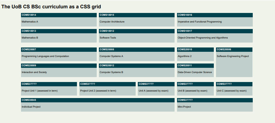
(If you are a MEng student, mentally replace "individual project" with "group project" in 3rd year and then 4th year should follow the same layout as 3rd year, but you don't have to edit this in the file for this exercise.)
The units are coded like this in the file:
<main>
    <div class="unit y1-tb1 cp20">
        <b>COMS10014</b>
        <p>Mathematics A</p>
    </div>
Each unit is a <div> with class unit and further classes declaring its teaching block and weight in credit points. SPE in year 2 is special and is the only unit declared as y2-tb4 with no CP class. By the way, why did we choose cp20 and not 20cp as the class name?
We are being pedantic here about separating content/structure (in the HTML file) and styling/layout (which you will write in a CSS file). There is no hint in the HTML file that the aim of the exercise is to lay the units out on a grid!
Our class names are purely semantic - they describe attributes of the units (academic year, teaching block, credit points), not how they should be displayed. There is some debate among web developers and designers just how far you should take this separation; we are being absolutely purist for this exercise, but even bootstrap, one of the most widely used web libraries, has classes like .col-4 to make something four columns wide. In practice the answer to how you separate concerns between HTML and CSS is really a case of "it depends".
Some general styles that you can apply in your curriculum.css:
body {
    font-family: sans-serif;
    background-color: rgba(112, 145, 53, 0.1);
}

.unit {
    background-color: rgba(0, 67, 79, 0.2);
}

.unit b {
    display: block;
    background-color: rgb(0, 67, 79);
    color: white;
    padding: 5px;
}

.unit p {
    padding: 5px;
}
This sets the colour scheme (derived from the official University of Bristol one), and some sensible padding/margins. The <p> elements already come with a default margin that we don't want to change here, but note that we applied the background colour for the text boxes to the <div class="unit"> element itself, not the <p> elements otherwise the margin of the <p> elements would not be coloured in. The 5px paddinjg that we declared everywhere creates some space between the text and the edge of the boxes, which makes the text easier to read.
We used <b> tags for the title bars that are normally inline elements, but we redefined them to be block elements here (this is allowed) so they span the whole width of their grid cell.
Exercise
- The grid should be applied to the
<main>element, with 12 equally wide columns and a maximum width of 1500px overall; you can center the grid for even wider screens withmargin: 0 auto;on the main element. - The gap between grid cells is
15px. - 10CP units should take up 2 of the 12 columns in width, 15CP units 3 columns, and 20CP units 4 columns. The 40CP project is 8 columns wide.
- All units are one row high except SPE which is 2 rows high.
- The aim of the exercise is not to write an individual rule for each unit! Try and use as few rules as necessary, you can do it with one rule per individual class that appears in the source file (you can even do it with a couple of rules less if you really understand grid layout).
- The main challenge will be getting the SPE unit placed correctly, and since this disrupts the normal flow of the layout, writing the necessary rules to get everything else after that to go in its correct place again.
Extra challenge:
- Notice that the gap between the academic years is twice as large as that within years (e.g. the vertical space between COMS10013 and COMS20007 is twice that between COMS10014 and COMS10013).
- This can be achieved by leaving an empty grid row between the years, thus doubling the grid gap. That is, Year 1 lives in rows 1 and 2; row 3 is empty; Year 2 lives in rows 4 and 5 and so on - the empty row 3 has a height of 0 and no elements, but there are two gaps between rows 2 and 3, and 3 and 4, that separate the Year 1 from Year 2 units.
- Alternatively, you could add extra margin (why not padding?) to the bottom of all TB2/TB4 units to achieve the same effect.
Responsive layout: trees exercise
Download the trees.tar.gz file for this exercise and extract it (tar -zxvf FILENAME) to a folder, then open trees.html in your editor. Create an empty trees.css in the same folder and open that too.
The file contains images and English and Latin names of some trees at Westonbirt, the UK national arboretum.
Your task is to write a stylesheet to create a responsive grid layout.
On media that is 600px or wider, the page should look like this:
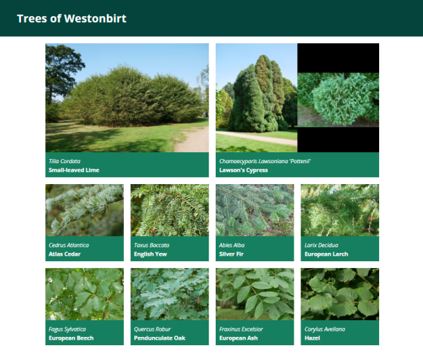
(The image for Lawson's Cypress is one single PNG like the others, there is nothing special to do here to fit in two images side by side.)
The small-leaved lime (Tilia Cordata) featured here is believed to be over 2000 years old, making it one of the oldest trees in Britain.
From 400px to 600px, the page should show all trees except the "featured" ones in two columns:

And below 400px width, all trees should be shown in a single column layout, whether featured or not.
Each tree is defined in the HTML file with an element like this:
<div class="card">
    <img class="card-image" src="images/cedrus_atlantica.jpg" alt="Cedrus Atlantica"/>
    <span class="latin-name">Cedrus Atlantica</span>
    <span class="common-name">Atlas Cedar</span>
</div>
The two "featured" trees at the start also have class featured on their card element.
Exercise
General non-grid-related CSS that you can just paste in:
body {
    font-family: "Open Sans", sans-serif;
    margin: 0;
}

header {
    background-color: #04443c;
    color: white;
    margin: 0;
    padding: 10px;
    padding-left: 50px;
}

.card {
    background-color: #167f5f;
    color: white;
}

.card-image {
    max-width: 100%;
    height: auto;
}

.card span.latin-name {
    display: block;
    font-style: italic;
    padding: 10px;
    padding-bottom: 0;
}

.card span.common-name {
    display: block;
    padding: 10px;
    padding-top: 5px;
    font-weight: bold;
}
- The grid should be horizontally centered if the screen is wider than the grid, by setting
margin: 0 autoon the container. - The grid should be applied to the container div, with a margin of 20px on top and bottom (this has to come after the horizontal centering), and a padding of 10px on left and right (this has to be padding, not margin, to avoid undoing the centering again).
- Set a grid gap of 20px.
- If the screen is at least 600px wide, then the container should have a maximum width of 960px and four equally wide columns. Featured trees should take up a 2x2 space on the grid, all other trees a 1x1 space.
- Between 400px and 600px, the grid should only be two columns wide, trees still take up 2x2 space if featured and 1x1 otherwise.
- Below 400px, make a grid with only one column, and all trees take up 1x1 space. Note that you do not need to do anything for this as this is the default - just make sure that your other grid rules such as making featured trees 2x2 only apply on larger screens.
Test this out by making your browser window wider and narrower. You cannot normally make a chrome/edge window narrower than 400px, but there are two workarounds. With the F12 developer tools open, you can position them to the right of the window and then drag the divider to make the actual page width as narrow as you want, or you can switch to "mobile" mode (second icon in top left of developer tools, usually) and manually set a page size or select one from a dropdown list of common phone models.
In practice, one would use a layout like this to make the individual grid elements clickable (such as news stories, or in this case links to a more detailed page about the tree).
One way to do this would be to use <a class="card" href="..."> elements instead of <div> ones, and set them manually to display:block. This has the advantage that the entire card, including the image, becomes clickable. An <a> tag can contain arbitrary content, not just text.
JavaScript
JavaScript is a programming language for creating dynamic web pages.
Videos
| Video | Length | Slides |
|---|---|---|
| JavaScript: Basics | 25 minutes | Slides |
| JS Objects (incl. JSON) | 6 minutes | Slides |
| Object Oriented Programming | 11 minutes | Slides |
| Asynchronous JavaScript | 12 minutes | Slides |
Readings
Essential
- MDN: Working with JSON
- MDN: Manipulating documents
- MDN: Asynchronous JavaScript
- MDN: Fetching data from the server (skip the section on
XMLHttpRequest)
Further
- MDN: Arrow functions
- MDN: Document Object Model (DOM) (see guides on the left)
- Wat, a famous lightning talk by Gary Bernhardt (2012).
Advanced
The following references go significantly beyond the curriculum.
- MDN: Inheritance and the prototype chain. This is a guide to the protoyping-style object-orientation of JavaScript.
- MDN: The event loop. This explains the concurrency model of JavaScript, as well as the way asynchronous code and promises arehandled.
- Structure and Interpretation of Computer Programs, JS edition (2022). This is a classic programming book that has been recently rewritten in JavaScript.
- Boris Cherny, "Programming TypeScript" (2019). This is a book-length introduction to TypeScript, a typed extension to JavaScript which is also supported by React.
Exercises
A single-page application to fetch data from a public REST API
In this lab, we are going to make a single-page web application to find information out about movies using JavaScript. You will learn how to use an API to fetch data and add it to the DOM of the HTML to view the results.
Setup:
The basic of the application can be found in the GitHub repository. Three files exist in the folder; maintain the same structure as we discussed in the lecture. The script.js file will be partially completed, and it is required to fill in the remaining code for the application to work properly. The image folder contains the necessary images for the application to work.
First, download the folder with the files and folders. A way to do it is by using wget:
wget https://cs-uob.github.io/COMS10012/exercises/part2/resources/movie-search.tar.gz
Then extract the contents using the command:
tar -xzf movie-search.tar.gz
This command will create a folder that includes the files we need to build the application.
Check if Node.js is installed with
node -v
If not, install it in your Debian VM with:
sudo apt install node.js
What is an API?
An API is an interface that a programmer can call to access and
manipulate information. For many websites these APIs are provided
as network services: you send GET, PUSH and POST requests as
normal and get data sent back in a suitable format (usually JSON or XML). This lets us pulling data into an application without the need to store it locally.
APIs are important components of modern software development due to several reasons. An API provides a standardized way for different applications to access each other's data, even when they have different implementations. Additionally, APIs are utilized to enforce security measures in our development process. They ensure that only authorized users or applications can access certain data, enhancing the overall security of the system.
Feel free to make any changes to the CSS and HTML files by adding or modifying elements, colors.
For this lab we will use a free API from themoviedb.org. This is a large database with movie data. To get an API key we must register to the site and create an account. Then from here we can request our API key.
To get an API key sign up at: https://developer.themoviedb.org/docs/getting-started.
Once the account is ready, create a new app:
- Type of Use: Desktop Application
- Application Name: MyCoolApp
- Application URL:
http://localhost - Application Summary: Learning JavaScripting and need an API to test against
Once the application is created it will give an API Key and an API Read Access Token on the API page: make a note of these!
This API is well-documented, and we can find all relevant information about how to make calls and use API methods in the following link: https://developer.themoviedb.org/reference/intro/getting-started
In the lab we will make HTTP GET requests to: https://api.themoviedb.org/3/discover/movie
We will create an app that fetches all the new and latest movies along with their details such as title, overview, and score. Instead of using a button, we will incorporate a search bar on our site to filter movies based on text input. The HTML code will not contain anything special, as we will populate the DOM with our JavaScript code.
Test it is working
At this stage, before we add any external functionality, lets check our website is working. Bring up a webserver serving from your site's root directory. If you don't have a webserver handy, Python has a simple one you can use for testing. Bring it up with:
python -m http.server
This will create a server listening on http://localhost:8000. Check you can access it in a web browser; then leave it running in the background.
Hint: You don't need to open a new terminal to run something in
the background. Hit C-z (control-z) to suspend a process. Run bg
to send it to the background and let it continue running, and fg to
bring it back to the foreground. See man 1p jobs or help jobs for
more information.
JavaScript
We load our JavaScript from the js/script.js file, but unless you've
taken it from the GitHub repository you'll find your server is
returning 404 File not found. We need to create it.
Then, add your API key at the end, or use the one provided above by replacing the XXX.
(Tip: Refer to the example on this page: https://developer.themoviedb.org/reference/discover-movie)
Code
const API_URL =XXX
const IMG_PATH = 'https://image.tmdb.org/t/p/w500'
const SEARCH_API = 'https://api.themoviedb.org/3/search/movie?api_key=XXX&query="'
The const IMG_PATH represents the poster_path (you can find more details in the API reference), and SEARCH_API concatenates a term from the search box into a query against the database. We aim for the most popular movies to be visible on our application page, replace the XXX with your API key.
Here, we declare the elements we want as constants to use them in our listener for the search box. To return an element object, we need to use a method. Fill in the missing method in the constants for each element.
const main =  XXX
const form = XXX
const search = XXX
This function below actually uses the API to fetch the movies we want.
function getMovies(url) {
    fetch(url)
        .then(response => response.json())
        .then(data => {
            showMovies(data.results);
        })
        .catch(error => {
            console.error('Error fetching movies:', error);
        });
}
For this lab, we want to improve our code by using the async/await method discussed in our lectures. We can find more theoretical details here: https://developer.mozilla.org/en-US/docs/Web/API/Fetch_API/Using_Fetch. The Fetch API returns a promise, and we'll ensure our code waits for the API response before proceeding, using async/await.
Replace the preceding code block containing the function getMovies(url) with a block that utilizes the async/await method.
After enhancing our code with asynchronous programming, let's observe the disparities compared to synchronous programming. What are the benefits of asynchronous methods? Why are asynchronous methods generally preferred and considered advantageous?
To display results on the DOM, we'll use a function called showMovies(). We'll create a constant to extract the desired data from the movie object. Then, we'll construct a
function showMovies(movies) {
    main.innerHTML = ''

    movies.forEach((movie) => {
        const { title, poster_path, vote_average, overview } = movie

        const movieEl = document.createElement('div')
        movieEl.classList.add('movie')

        movieEl.innerHTML = `
            <img src="${IMG_PATH + poster_path}" alt="${title}">
            <div class="movie-info">
          <h3>${title}</h3>
          <span class="${getClassByRate(vote_average)}">${vote_average}</span>
            </div>
            <div class="overview">
          <h3>Overview</h3>
          ${overview}
        </div>
        `
        main.appendChild(movieEl)
    })
}
The utility function getClassByRate changes the color of the vote to blue if it's equal 8 or higher, black if it's equal 5 or higher, and orange otherwise, indicating it's not recommended to see. Fill in the if-else statement appropriately:
function getClassByRate(vote) {


}
Here we create the listener that detects the search submit. We need a function here to handle our event object. Fill in the missing method by replacing the XXX with the appropriate one.
// Get initial movies
getMovies(API_URL_HOME)

form.XXX('submit', (e) => {
    e.preventDefault()

    const searchTerm = search.value // we create a var with the search term

    if(searchTerm && searchTerm !== '') { // and if the term exists
        getMovies(SEARCH_API + searchTerm)

        search.value = ''
    } else {
        window.location.reload()
    }
})
Then, whatever we type in the search area will be appended to the search API to retrieve a response. Subsequently, the page reloads with the results. Feel free to search for any movie names in the search box and press enter! Resize the browser to inspect the flex effect, review these options in the css file.
When using an API key in JavaScript to access an API, we need to follow security best practices to protect the API key and prevent misuse.
Here's a guide on how to securely handle API keys in JavaScript:
In summary, this application serves to demonstrate how to utilize third-party REST APIs, how to use Fetch, and how to insert data into the DOM for viewing. When our API keys are hardcoded into JS code, they become easily accessible to anyone who views the source code. Therefore, we will use a technique to secure our API calls by using Environment Variables in Server-Side Code Only.
Without this technique, it could result in theft or misuse by attackers who may use the API key for malicious purposes, such as accessing sensitive data or performing unauthorized actions.
We make our JS code more secure by learning how to save our API key in a .env file and keep it secure and separate for the rest of the code on the server. To ensure that the sensitive API keys and URLs are only accesible on the server-side and not exposed to the clients we need to modify our script.js and create a server.js file. We will remove the direct usage of the API URLs and key and replace them with variables that will later inject from the server-side.
Fetching enviromental variables from the server allows more dynamic configuration and separates client-side code improving our code maintainability. The implementation also needs use of HTTPS to hide our environment variables transmitted over the network. We will explore this technique in a following lab.
Locally on our lab machine we need to install nodejs and dotenv package in the application folder:
sudo apt install nodejs

sudo apt install npm

npm install dotenv
(Tip: More info can befound on this page: https://www.npmjs.com/package/dotenv)
Follow the next steps:
-
Create a new file in the project's directory and name it .env
-
Inside the .env file define the API key. For example use MOVIES_API_KEY. Then assign the value of the API key.
(Tip: If we commit to a repository don't forget to add the .env to the .gitignore file to prevent the API key to be commited to the repository.)
- Replace the API key inside the code by using an enviromental variable.
(Tip: In some case we want to encrypt the .env to add more security to the implementation.)
This setup ensures that our API key is securely loaded from the .env file and is not hardcoded in our JavaScript code.
In the script.js remove direct usage of the API URL and replace them with variables that will later inject from the server. For example:
const API_URL_HOME = "{{API_URL_HOME}}";
const API_URL = "{{API_URL}}";
In the root folder create a server.js file to instruct how to use the API URLs and serve them to the client. The client-side JavaScript code cannot directly access the API URLs, we verify with the browser inspector tool.
In the server.js import the Node.js modules as variables: http, fs, path, dotenv.
Use the dotenv module to load variables from an .env file into a process.env object. With this object we ensure the store of our sensitive API key. In our code define a port for our server to listen on. FOr example:
const PORT = process.env.PORT || 3000;
Use a method to create an HTTP server that can take a callback function as an argument. This method should be invoked in every request to the server. Then determine the requested file path on the URL in the request with fs.readFile() This will read the requested file asynchronously. Then ensure the correct contect type for the HTTP response headers. Next step is to serve our static files such as the HTML, CSS, JS file and images. use the fs.readFile().
Finally, start the server with the server.listen() method for example:
server.listen(PORT, () => {
  console.log(`Server is running on port ${PORT}`);
});
Now we have an HTTP server ready to serve static files and handle users request'. Don't forget to keep the project stracture as follows:
project/
├── index.html
├── css/
│   └── style.css
├── js/
│   └── script.js
├── img/
│   └── favicon.ico
│   └── logo_TMDB.svg
└── server.js
We access our application by going to our project directory and in the terminal run the following command:
node server.js
If we are not getting any errors we can access then the application in the browser by navigating to http://localhost:3000
Extras
Now we've got a basic site up and running keep working on it... here are some ideas of where to go next:
- Make it faster, make the code clearer!
- Can we add a separate page for TV series?
- Add more information about the movies to the DOM. The database contains a lot more stuff!
Web Scraping
Videos
| Video | Length | Slides |
|---|---|---|
| Crawling | 16 minutes | slides |
| BeautifulSoup | 10 minutes | slides |
Exercises
Crawling the Web
So far in this unit we've had you use wget only for one of its simplest
use-cases: when you want to download a single file from the web. Consistent with
the Unix philosophy that tools should 'do one thing well', wget is capable of
a lot more than this.
To demonstrate this, we're going to have you first run a server to deploy a
website locally, and then test out various wget options by connecting to that
server via localhost. This of course doesn't mean that wget can only do these
things via localhost -- it's designed to work with real websites -- but we
decided that getting ~200 students to test out web-crawling on a particular live
website was probably not a great idea, so we're having each of you run your own.
Set up the server
As with the HTTP exercises, it would be best to either carry out these steps directly on a lab machine or on your own machine (optionally from the Debian Linux VM with ports forwarded). If you are using a lab machine via SSH instead then you'll need to open a second SSH session to the same lab machine in another terminal, to act as a client for the next parts of the exercise. However, we'll periodically invite you to check things in your browser, which is a lot simpler if you're not trying to use a remote machine.
First, download the webpages to be served by the webserver.
If you like you can even do this using wget:
wget https://cs-uob.github.io/COMS10012/exercises/part2/resources/cattax.tar.gz
Then extract the contents of the tarball using tar -xzf cattax.tar.gz in the
folder you downloaded it to. This will create a folder cattax which contains some
webpages and resources.
Next, use the darkhttpd server from a previous week's exercises to
serve the content of the cattax folder on localhost:8080. (Refer to the
HTTP week's exercise instructions if you have forgotten how to do this).
You can check that this is working in a browser (unless you are connecting via
SSH) by navigating to localhost:8080/index.html -- you should see a webpage
talking about Felidae. You'll need to leave this server running -- the
simplest way forward would be to open another terminal for the steps below.
(Alternatively: use your shell expertise to figure out how to run the server in
the background without its output interfering with the rest of what you're going
to be doing in this terminal).
Single-page download
To keep your filesystem tidy, we're going to work within a 'client' folder.
We'll be repeatedly downloading files and sometimes deleting them, and you'll
neither want lots of duplicated webpages littering your filesystem nor want to
run rm * in a directory that possibly contains files you don't want deleted.
Make sure you are in the parent directory that contains cattax (i.e., you can
type ls and see the directory cattax in the output) and not inside
cattax itself. Then create a directory and move into it:
mkdir client
cd client
Now we'll start with the simple use of wget you have already become familiar
with:
wget localhost:8080/index.html
This downloads the same index.html as is being served from cattax by
darkhttpd. However, if you open this downloaded file in your browser, you'll
see that there's a sense in which something missing -- wget has only
downloaded the specific HTML file you requested, and not any of the resources
that the page itself references, like the CSS file -- so the version you open in
your browser from your client directory won't look the same as the version
being served via localhost. This can be desirable default behaviour (we only
asked it to get that page, after all), but if we wanted to download a copy of a
webpage and later read that webpage's copy with the styles and images it was
originally created to contain, we'd need to get wget to also download these
resources.
One way to do this would be to manually identify each of the required resources
and download them one-by-one. But this is tedious, repetitive work -- highly
suited to automation -- and moreover, wget can save us the effort. Try the
following, and read the output.
wget -p localhost:8080/index.html
Notice that this time wget downloaded multiple files. It also created a
directory named localhost:8080 to store all the files in. This is helpful
organisation if you're ever using wget to download pages from multiple
different websites -- it stores them under directories named after the domain
you requested them from.
If you read the output carefully you'll notice that as well as the index.html
we requested directly, wget has also downloaded the catstyle.css file
referenced in that page, and another file called robots.txt that you didn't
ask for and which isn't mentioned in index.html. This 'robots' file is part of
a standard for responsible web crawling, and tells crawling tools which parts of
a website they are or aren't allowed to visit. When you use wget to crawl a
webpage or website it will check the site's robots.txt to understand which
resources it may not be allowed to download. You can read more about how these
files are written
here.
Open the index.html file from the new localhost:8080 folder that was
created, and you should see that it looks just like the version you got in your
browser by navigating to the URI localhost:8080/index.html. (There are some
cases where this wouldn't be true for a webpage -- wget can sometimes not be
permitted access to some resources required to display a page the same way as it
is shown in your browser).
Crawling a site
The version of the webpage you downloaded using the previous command still has
one major flaw: the links on the page don't work. Or, rather, the links to the
'Felinae' and 'Pantherinae' pages are broken, because those links are made
relative to the webpage, and the corresponding files don't exist in the client's
folder. The link to Wikipedia in the page footer does still work, because the
href attribute of that link is set to a full URI.
What do we do if we want to download more than one webpage from a site? Wget
supports something called 'recursive downloading'. Simply put, when used in this
manner it will follow all links internal to a site and download the resources
displayed at those links, storing a copy locally and creating a directory
structure if necessary. One version of this recursion is to use the -r (or
--recursive) option, which downloads all linked pages up to a certain maximum
depth. Try this out:
wget -r -l 1 localhost:8080/index.html
This downloads recursively with the 'level' (maximum depth of recursion) set to
1 level of recursion. You should see that both the requested index.html and
the two pages linked from that resource have been downloaded, along with
robots.txt. Notice as well that the Wikipedia page has not been downloaded --
it's not hosted at localhost:8080, so wget ignores it, and the link will
work from the downloaded page anyway. Our two newly-downloaded pages, however,
will contain dead links to other pages, because we limited the depth of
recursion to just one hop. If we increase this:
wget -r -l 2 localhost:8080/index.html
You'll see that a lot more files get downloaded. These are only very small,
simple web-pages, without many links (contrast, for example, any given Wikipedia
page). Very short recursion depths can capture an awful lot of a domain, and if
you ever tell wget to crawl links without caring about which domain they
belong to, this becomes explosively worse (-l 2 in such a case for our
index.html would involve
downloading everything linked from the Wikipedia page referenced in the footer
-- several hundred resources). In the case of our cattax website, however,
there are still a few pages that are more than 2 steps away from the index page.
Let's start afresh:
rm -r localhost:8080
wget -m localhost:8080/index.html
The -m flag is designed to provide some sensible defaults for 'mirroring' an
entire website (something you might do if you wanted to keep a copy of it for
offline browsing, or for providing a public backup of a valuable resource). It
sets the recursion level to infinite and checks timestamps before downloading
files, as well as setting a few more configuration settings. For many cases
where you might want to download an entire website, this is the flag you would use --
perhaps also with a polite -w 1, which sets a 1-second delay between requests,
to avoid over-burdening the server if the website is large.
Further Exercises
- Read
man wgetto understand what the-i--force-htmland--spideroptions do. Download a copy of this webpage (the one you are currently reading) and usewgetto test all the links on the page. Are there any broken links? - Tell
wgetto use a different user agent string in a request to your server running on localhost. Check what the request looks like to your server. - How would
wget -r -l 1 http://example.comdiffer fromwget -p http://example.com? (Hint: think about external resources). - Look for 'Recursive Accept/Reject options' in the
wgetmanpage. How would you getwgetto crawl pages from multiple different domains? - Look up what
-ncdoes. What is clobbering, and why would or wouldn't you want to do it?
BeautifulSoup
Previously in this unit we have taught you how to construct webpages, including how to construct webpages so that they present structured information (e.g., the contents of a database). The presumption has generally been that you are designing webpages for (usually visual) consumption by a human using a standard web browser, or at most writing Javascript functions that will help a human use a webpage in particular way.
However, there are situations where you may need to write code that interacts with webpages in an automated fashion -- perhaps to extract some data from webpages that isn't available in a more machine-friendly format. This scraping of webpages is a valuable (if sometimes maliciously applied) skill that can be useful to many kinds of software engineers and data scientists. This exercise talks you through some applications of one of the most common frameworks, a Python library called BeautifulSoup.
Setup
First, you want to install the BeautifulSoup library, which you can achieve with
sudo apt install python3-bs4. Python does have its own package manager, pip,
but it would get in the way of our system-wide package management to use it here.
You can test that Python is working by just typing python3 at the command line
-- it should launch the interactive interpreter, which will prompt you for
Python code with >>>. Type from bs4 import BeautifulSoup. If this completes
then you've successfully imported the library.
Interacting with Soup
Next, enter something like the following:
file = "cattax/index.html"
soup = BeautifulSoup(open(file, 'r'))
(You may need to change the 'file' line to reflect where the cattax/index.html
file really is relative to where you launched python3. Also, if you close the
interpreter at any point remember you'll need to re-run the import line above
to get the library).
You now have a 'soup' object, which is a Python object that has various methods
for interacting with HTML (and XML) documents and accessing their contents. To
start with, just type soup in your interpreter. Python will print out the
basic textual representation of the object, which is just the source of the
index.html page. Next, let's attempt one of the commonest use-cases for scraping.
soup.get_text()
You should see a string containing the textual content of the webpage. If you
call print on the result, you should see that the text has been laid out in a
fair approximation of how the visible text would appear on a webpage.
text = soup.get_text()
print(text)
Getting the visible text out of a page is a common requirement if, e.g., you
were going to use the webpage as input to an NLP system. You can also access
non-visible portions of the page -- soup.title will give you the title element
of the webpage, and soup.title.text will get you the textual content within
the title element. Note the difference: soup.title is a BeautifulSoup element
(of type Tag), and has methods associated with being a tag; soup.title.text
is just a string, and only has methods that apply to strings.
As HTML documents are structured, you can interact with them in a structured
manner. soup.head will get you a soup object reflecting the 'head' part of
the HTML structure, and soup.head.findChildren() will return a list containing
all of the 'children' elements inside the head. By knowing the structure of the
document you can thus navigate to certain elements programmatically. This
doesn't just relate to the tags, either: you can also access the value of
attributes. soup.head.meta['charset'] would access the charset attribute of
the meta tag in the head of the document.
Exercises
- Take a look at some other examples from the BeautifulSoup documentation, in particular regarding the use of the
.find_all()method. - Use your interpreter to access a list of all the
<strong>elements in the webpage, and figure out how to print out just the text contained within them. - How would you use
.find_all()to find all<div>elements with a particular class value (e.g., 'container')? Would your method work if the div had multiple classes?
A Scraping Script
Download this python script to the directory that
contains your cattax folder (not into cattax itself). On the command line,
you should be able to run this script with python3 scrape.py. You'll see that
it prints out a series of lines related to all the files in cattax.
Open scrape.py in an editor and inspect what it is doing. The script imports
two libraries, one is BeautifulSoup and the other is os, which allows the
script to use certain operating system functions. os.listdir is then used to list the
contents of our cattax directory and iterate over them. We filter the
filenames by checking to see which of them end with the string 'html', and if
they do then we open the file and parse it into a BeautifulSoup object. Then, we
print out text from certain elements, separated by a ':'. Understand how this
works, asking a TA or lecturer for help if you aren't sure.
Exercises
- Modify
scrape.pyso that it also prints out the contents of the 'info' paragrah in each page (this can be a second print statement). Run the script again to test that it works. - Currently the script prints something for every page. Modify it so it would only print something out for the leaf nodes -- those pages that don't have a 'container' element of their own.
- Printing things out can be useful, but often we want to store values we
scrape for later programmatic work. Rather than printing out information,
create and update a Python dict for all
leaf nodes where the dictionary keys are the titles of a page and the values are
the corresponding content of the 'info' box. Run your script with
python3 -i scrape.pyand it will execute your script and then place you in an interactive session immediately following your script's execution. You can then check that the dictionary's contents are what you expect by interacting with the dict object in your interpreter.
When to scrape
As we discuss in this week's lectures, scraping webpages can come with some risks, depending upon how you go about it and what you do with the results. Guidelines you should follow include:
- Always respect the robots.txt presented by a site. Resources denied to crawlers may be protected for a legal or ethical reason.
- Always look for an API first. If a site will provide you with a JSON endpoint to query for the structured data you want, it is both easier and more polite to use that API instead of scraping the same data from webpages designed for human consumption.
- Be very careful about any scraping behind an authenticated log-in, such as from a logged-in social media account. Think about the privacy expectations people have about the content you are collecting, both in legal and ethical terms. If you post publicly something that was intended only for a limited audience, you could be betraying a confidence, and might even face legal repercussions.
- Generally beware that being able to access and read information from the web does not mean you are permitted to republish it, even in a modified form.
Further reading
You may have noticed that we downloaded our webpages with wget in the previous
exercise, and then dealt with their content using Python in this one. If you
were writing a Python tool that was meant to do something specific with the
content of a webpage, then you would often want to avoid using a second tool,
and make web requests directly from your program.
The Python library that is most often recommended for requesting web resources
is the Requests library, and
getting familiar with it would be useful both if you wanted to access web pages
programmatically and if you need to interact with a website's API.
We've also been dealing with the content of static websites, without the dynamic content like that you learned about in the Javascript exercises. Scraping dynamic sites gets trickier, as your scraper needs to have a browser-like context to execute Javascript within, and often might need to pretend to interact with the page. Systems like Selenium are designed for cases like this.
Practical Encryption
Videos
| Video | Length | Slides |
|---|
Exercises
Introduction to OpenSSL: A Hands-On Lab using OpenSSL and encryption
OpenSSL is a widely used open-source software library that provides cryptographic functions and protocols to secure communications over computer networks. In this lab, we will gain hands-on experience with OpenSSL by performing cryptographic operations. The goal of this lab is to learn how to generate cryptographic keys, create digital certificates, and perform encryption and decryption operations.
Objectives:
- Understand the purpose and role of SSL Certificate Authorities in web security.
- Create a root Certificate Authority (CA) for local development.
- Generate SSL certificates for localhost domains.
- Configure web servers to use the self-signed SSL certificates for HTTPS.
- Test the secure communication with HTTPS-enabled web servers.
First we install the OpenSSL tool
Use your VM to install openssl with the appropriate command. On Debian that is:
$ sudo apt install openssl
Alternatively, you could build from the source https://www.openssl.org/source/ after obtaining and extracting it:
$ ./config
$ make
$ make test # This step is optional.
$ sudo make install
Remember that you can add the apt install line to your Vagrantfile to use OpenSSL on Vagrant.
Use OpenSSL to encrypt files with symmetric encryption
Create a text file called mytext.txt and write a message you want to send inside it.
Then, encrypt this file with a symmetric AES 256 key using OpenSSL:
openssl aes256 -in mytext.txt -out mytext.enc
You'll be asked for a passphrase to create the key. The output will be named mytext.enc. Be sure not to forget your passphrase.
What is the difference between your unencrypted file and the encrypted one? Try and read an ecrypted file.
Alternatively, you can encode the encrypted file with base64. This option creates a file with ASCII characters instead of a pure binary stream, making it suitable for sending via email. To do this, encrypt again specifying base64 instead of AES 256, and also passing the -a flag.
Is the file size larger than before? If so, why?
Now, you can send your encrypted sensitive information to the recipient.
How to decrypt using OpenSSL
Use email or another method to swap encrypted files with someone. Utilize the -d parameter to decrypt the file, whether it's a binary stream or consists only of ASCII characters. You'll need to use the same passphrase for this as was used to encrypt the file.
Once decrypted, can you read the correct message?
Use OpenSSL to encrypt files with asymmetric encryption
Asymmetric encryption uses two sets of keys, called a key pair. A public key that can be freely distributed with the entity you want to communicate with, and a private key that is never shared.
Generate key pairs
Using the openssl man pages, figure out how to use genrsa to generate a 1024-bit public-private key pair.
Distribute the public key
The public key is meant to be shared with others. Extract your public key with the OpenSSL tool into a .pem file using the -pubout parameter.
Exchange your public keys
Exchange public keys with someoone else. Next, create an encrypted message using the OpenSSL -encrypt command. You will need the following to formulate the command:
- Name of the file
- Other's person public key to encrypt
- The name of the output file
Try and view the file, what is the format?
Send the file to the other party using your preferred method. The other person can decrypt the file and read the message using the private key and the parameter -decrypt. The recipient can write a response, encrypt it with your public key and send it back.
Why do we need HTTPS?
Websites with HTTPS provide assurance to customers that their connections are secure. HTTPS, or Hypertext Transfer Protocol Secure, is a protected version of HTTP, the protocol used for data transmission between your browser and the website you're accessing. Prioritizing the safeguarding of users' privacy and data security is crucial for instilling trust in people connected to the web services we develop online
Why will we use HTTPS locally?
We need to create a development environment that closely resembles production. This practice helps to avoid future issues when deploying your web apps or websites online.
Configure and utilize Nginx with HTTPS for creating a localhost web app and sign a certificate request with OpenSSL.
A certificate signing request (CSR) consists of three entities: the public key, the system that triggers the request, and the signature of the request. The private key will be used to encrypt the certificate. We will use OpenSSL for that.
To create a private key with OpenSSL, we first create a directory and generate the key inside it:
$ mkdir ~/store-csr
Then, we generate the RSA private key (keep note of the passphrase). Use OpenSSL with the genrsa command and the -aes256 parameter for a private key with size 2048. Next, generate a root certificate with OpenSSL using the req command and parameters -x509 for a digital signature and -sha256 for a hash function. Finally, make it valid for 30 days.
Then, we will make a request for the server we will use later, and we want to authenticate, for example:
$ openssl genrsa -out cert.key 2048
As we can see from the output, we generated an RSA private key of 2048 bits. The genrsa command is used to generate RSA private key files, with the default value being 512 bits. You can specify different key sizes. Investigate the command options with -help.
Now, with the private key, we will create the CSR using the OpenSSL tool. Fill out the fields in a similar way as above, without leaving any value blank. We use the private key to create a certificate signing request as follows:
$ openssl req -new -key cert.key -out cert.csr
Create the Configuration File
We create a configuration file named openssl.cnf in the current folder using any text editor of your choice:
[#]Extensions to add to a certificate request

basicConstraints       = CA:FALSE

authorityKeyIdentifier = keyid:always, issuer:always

keyUsage               = nonRepudiation, digitalSignature, keyEncipherment, dataEncipherment

subjectAltName         = @alt_names

[ alt_names ]

DNS.1 = your hostname
Sign the certificate request and enter the passphrase. Verify the correctness of the certificate as follows:
$ ~/store-csr$ openssl verify -CAfile rootCert.pem -verify_hostname your hostname cert.crt
Add the certificate to the browser to avoid receiving warnings about untrusted certificates. For the Mozilla browser, follow these steps:
- Go to Preferences -> Privacy -> View Certificates.
- Import the rootCert.pem file.
- Click "Next" and then select "Trust this CA to identify websites."
- These steps will ensure that the root certificate is trusted by the browser for identifying websites.
Tip: if you want to name or re-name your machine use: sudo hostnamectl set-hostname [new-hostname] and check with hostnamectl
Move the certificate and key into the folders:
$ ~/store-csr$ sudo cp cert.crt /etc/ssl/certs/
$ sudo cp cert.key /etc/ssl/private/
Nginx Configuration
Install Nginx:
$ sudo apt install nginx
Create a configuration file inside /etc/nginx/sites-available. For example, create a file yourhostname.conf:
/etc/nginx/sites-available$ sudo nano myhostname.conf
server {
    client_max_body_size 100M;
    server_name yourhostname;
    listen 443 ssl;
    ssl_certificate /etc/ssl/certs/cert.crt;
    ssl_certificate_key /etc/ssl/private/cert.key;

    location / {
        proxy_pass http://yourhostname:8000;
        proxy_set_header Host $host;
        proxy_set_header X-Forwarded-Proto https;
        proxy_read_timeout 60;
        proxy_connect_timeout 60;
        proxy_set_header X-Real-IP $remote_addr;
    }
}
Edit your bash /etc/hosts file and add the line bash 127.0.0.1 “yourhostname” using sudo.
Restart the server:
sudo systemctl restart nginx.service
Tip: If you encounter any error check with sudo tail -f /var/log/nginx/error.log
Create a symbolic link between the sites from nginx and your configuration file:
sudo ln -s /etc/nginx/sites-available/yourhostname.conf /etc/nginx/sites-enabled/
If everything is configured correctly, you should have access to your local website with your self-signed certificate, i.e., https://my-hostname/. This is a good way to test your web application locally before publishing it. Now you have created a local development environment to test your apps using HTTPS.
How to use OpenSSL to test an SSL connections
The OpenSSL tool includes many utilities. We can use one of them to verify a secure connection to a server. To do so, we will use the s_client utility to establish client-to-server communication. Therefore, we can determine whether a port is open, if the server is configured to support SSL, and when the certificate expires.
In the terminal, use s_client against a webserver with HTTPS.
What are the differences compared to other tools such as netcat or telnet?
Try running the command again with the -crlf and -brief flags. What is the difference?"
Introduction to PGP encryption
This hands-on lab session aims to introduce you to PGP (Pretty Good Privacy), widely used encryption software for securing email communication and data files. Through practical exercises, you will learn how to generate PGP key pairs, encrypt and decrypt messages, sign and verify files, and exchange encrypted emails. This lab will provide all the essential skills for using PGP for secure communication and data protection.
Objectives:
- Understand the principles of PGP encryption and digital signatures.
- Generate PGP key pairs for encryption and signing.
- Encrypt and decrypt messages using PGP.
- Sign and verify files using PGP digital signatures.
- Exchange encrypted messages with classmates.
Generating PGP Key Pairs to begin GPG tool to encrypt all the communication we want.
Use your VM to install gnupg with the appropriate command (if not already installed). On Debian that is:
sudo apt-get install gnupg
First, create a keypair with the command:
gpg --generate-key
Tip: Don’t forget the passphrase, use a strong one!
You can send your public key by exporting it through the GPG application:
$ gpg --output ~/mypub.key --armor --export youremail@mail.com
You can send the key by email or any method of your choice.
How to import locally foreign public keys
We need to accept other users' public keys if we want to communicate with them. When you receive others' public keys, import them using the import parameter.
Tip: There are other options to share your public key, such as using a public key server. Here's how to verify other keys.
While it's generally safe to distribute your public keys, caution should be exercised when obtaining keys from other users. Therefore, it's crucial to verify the identity of others before importing their keys and initiating communication. A quick method to accomplish this is by comparing the fingerprints derived from those keys. Use the following command:
$ gpg --fingerprint youremail@mail.com
This will result in a more concise string of numbers, making it easier to compare. We can then verify this string either with the individual themselves or with another party who has access to the person in question.
Now sign the keys
By signing each other's keys, we essentially indicate trust in the keys we possess and confirm the identity of the individual associated with that key.
$ gpg --sign-key youremail@mail.com
To ensure that the person whose key you're signing benefits from your trusted relationship, send them back the signed key. You can accomplish this by typing:
$ gpg --output ~/signed.key --export --armor youremail@mail.com
Upon receiving this newly signed key, they can import it, incorporating the signing information you've generated into their GPG database. They can achieve this by using the import parameter.
Now that you have established a secure channel to communicate with trusted ends, you can send and receive encrypted messages with each other!
After sharing your key with the other party, you can now send and receive encrypted messages. You can encrypt your messages with the following command:
$ gpg --encrypt --sign --armor -r other_person@mail.com file_name
This command encrypts the message and signs it with your private key to ensure that the message originates from you. The output will be an encrypted file with the extension .asc. You can use the cat command to view the file.
Keep in mind that this message will be encrypted using the recipient's public key, making it unreadable to you (Unless you somehow obtain the recipient's private key!).
Tip: You can modify the command above to generate a message only you can read, using your private key. Think about how.
Decrypt received messages
Upon message receipt, you would be able to read with the gpg command and the decrypt parameter.
Tip: In case you have a raw stream text message, paste the message after typing gpg with no arguments. Then press CTRL+D to end the message.
If you've completed all the above steps correctly, you can now communicate securely with different individuals. You can send your public key to multiple recipients and import multiple keys as well. This is an essential step to keep your messages private and protect your sensitive information from eavesdropping attacks.
Import other people's public keys from a public key server
An alternative method to share your GPG keys is through a public keyserver. Anyone can upload a key to a public server, making it accessible to others who may need to communicate securely with you.
Export your public key using:
$ gpg --armor --export email
Send your public key to a public server using the --send-key parameter. By default, your key is sent to https://keys.openpgp.org/, or you can specify a different key server using the --keyserver option.
Before importing a user's key, verify its validity with the command gpg --list-sigs user_id where the user_id is for example the email address you want to communicate with. To find a key on a public keyserver, use the --search parameter.
Import the key you want with the --import parameter. You can once again verify the sender's identity using the --fingerprint parameter and checking its validity via a second channel. Then, similarly, sign the key obtained from the public key server.
Here you can find some key IDs of people you may certainly know:
- 413109AF27CBFBF9,
- 9A88F479F6D1BBBA,
- 1C29680110FA7E87
These keys are on the http://keyserver.ubuntu.com// public keyserver.
- Use the
gpgcommand with the--searchparameter to find out, for each key, the associated email address or User ID (username). - Use the
gpgcommand with the--recv-keysparameter if you decide to import a key into your keyring. - Use the
gpgcommand with the--fingerprintoption to verify the authenticity of the keys. - Now, can you try searching based on the email addresses?
- Can you find Joseph's old expired key?